Client Project · Englewood CAC
Englewood Community Action Council
Designing the first real website for a Chicago neighborhood education council, so families can find help, sign up and get involved in one place.
Community Engagement
Bilingual Design
Web Design
AI Prototyping
My role
UX Designer
Team
5 teammates
Timeline
5 weeks · Spring 2026
Result
Site handed off to the council

Our final homepage design in Figma Make. The council now runs its own version.
The problem
A busy council with no front door online
ECAC runs events, workshops and monthly meetings for Englewood families, but its domain sat unused. Sign-ups, event info and parent resources were scattered or missing.
“A lot of applications ask for a website, and we don’t currently have a strong one.”
ECAC COUNCIL MEMBER, CLIENT INTERVIEW
× No way to apply to join the council
× No advance RSVP for events
× No home for parent resources like IEP guidance
The client, on why the site mattered.
My role
I set the research foundation and led the design
Research
Ran the early research and turned the client interview into personas, goals and a site map.
Team setup
Introduced the team to Figma and set up a shared FigJam to hold our notes and insights.
Design & build
Used AI-assisted prototyping to turn rough drafts into a design that matched the council’s vision.
Client reviews
Walked our client through each prototype over Zoom and made most of the revisions that followed.
Who it’s for · Personas
Three personas we designed for
Maria, James and David are proto-personas we built from the client interview to guide design decisions. Their quotes are illustrative, not from real community members.
Maria · Parent
Short on time. Needs IEP help and event details she can find on her phone.
“I just need clear, reliable information to help my kids succeed without feeling overwhelmed.”
James · Advocate
Wants to join committees and meetings, but can’t tell how to get involved.
“I want to be involved, but I need to know exactly where and how to show up.”
David · Funder
Judges small nonprofits by their websites. Outdated pages lose his trust.
“I need to quickly understand the impact. If it’s not clear, I move on.”
“Welcoming and inviting, but still professional. Not boring or overly corporate.”
ECAC council member, on tone
From needs to features
Every request became one clear action
We mapped the client’s asks and our personas’ needs to five sections. Each one ends in a single call to action.
People can’t sign up to join
Apply to Join form
Events need registration
RSVP on every event
Parent help is hard to find
Resources grouped by need
No evidence of impact
Stories and numbers
Meetings feel closed off
Public Zoom link
Structure
Five sections, five calls to action
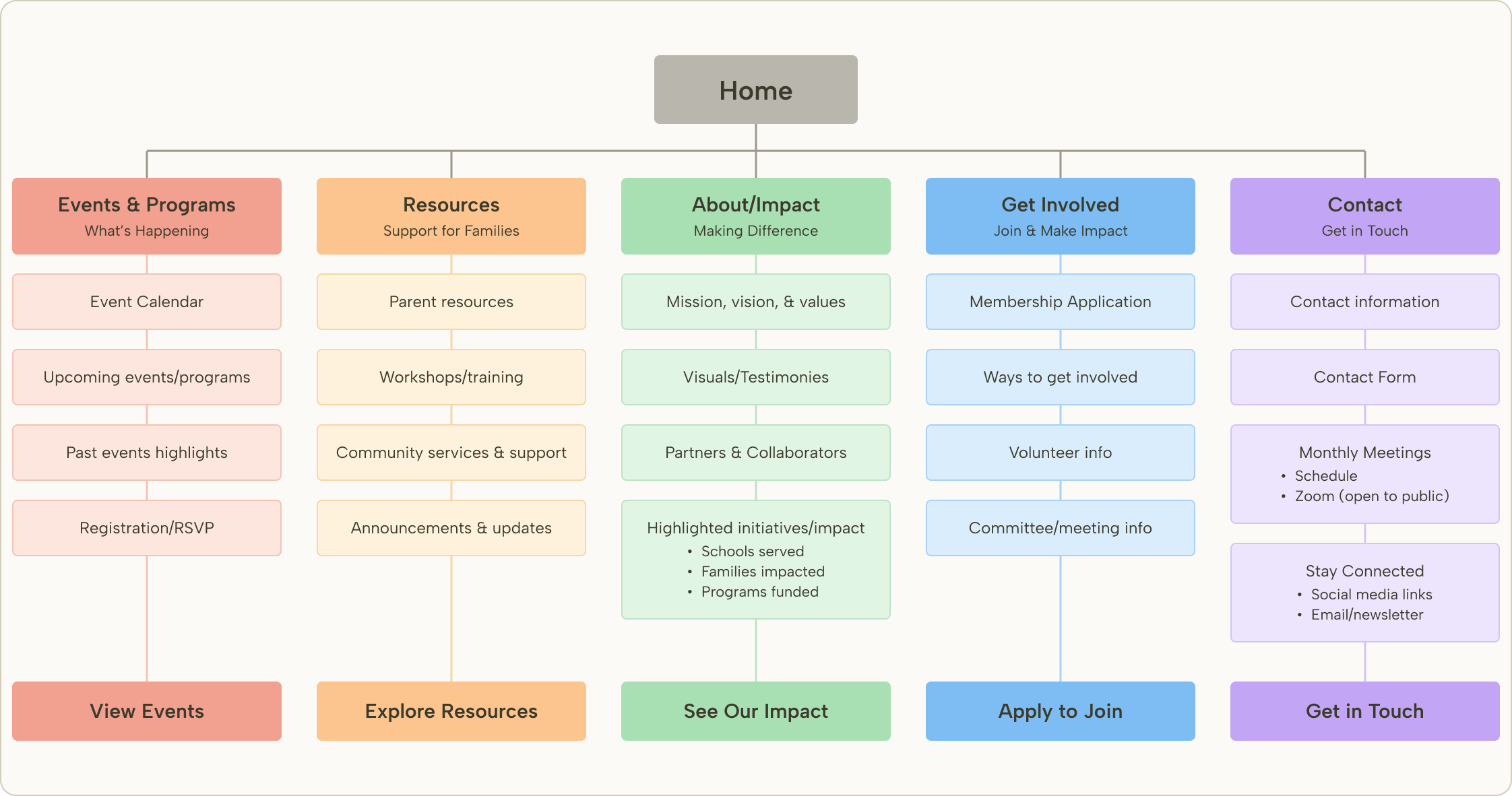
Our site map, rebuilt from our FigJam. We studied about 20 other community action council websites first, then gave each column one action that section exists for.
Client feedback
Denise’s input shaped how we built it
We walked Denise Dyer, a lead member of the council, through each prototype over Zoom. After a missed first meeting, she answered our questions by email.
A site the council can keep up to date
Moved the build to Lovable so she can edit it herself
Welcoming, not overly corporate
Warm colors, real school photos, plain language
Iteration
We moved off our favorite tool so the council could own the site
Our final design
Figma Make
Where we designed and refined the site over 100+ AI-assisted versions. Hard for non-technical council members to edit.
After handoff
Lovable, updated by the council
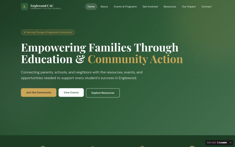
We rebuilt the design in Lovable so council members could edit it themselves. They have since changed it to fit their needs.
Why we switched
The client didn’t want a site that “looks outdated or abandoned.” A polished site they couldn’t edit would end up exactly that, so we rebuilt it in Lovable, where council members can update events and announcements themselves.
Final design
Warm, simple and built around signing up
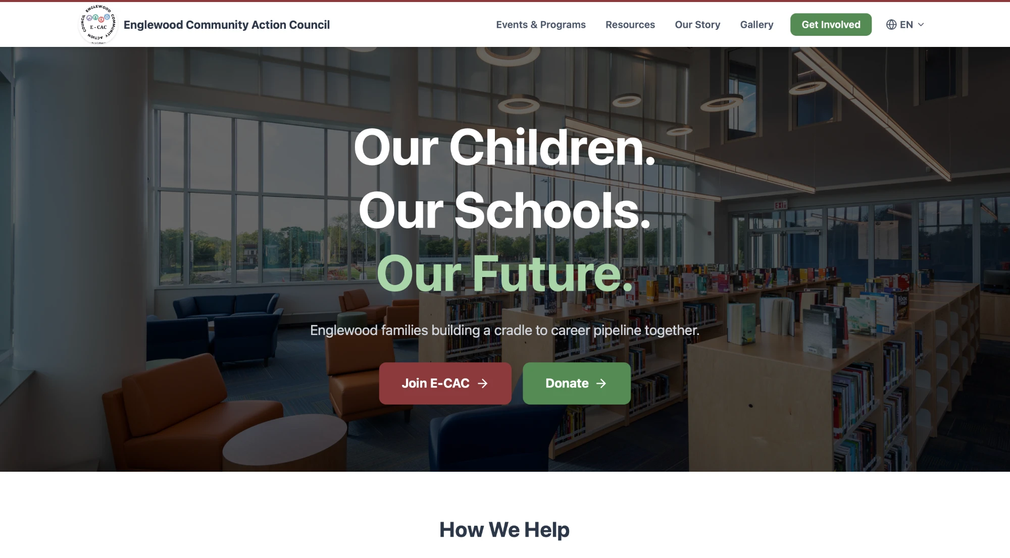
Our final design in Figma Make. Maroon and green, real photos of Englewood schools and plain language give the council a credible look without feeling corporate. Every page also switches to Spanish.
Home
Home: a full-width photo hero with two clear actions, Join E-CAC or Donate.
• Join and donate from every page
• Community calendar
• Parent resource links
• English / Español toggle
After handoff, the council kept editing the live site in Lovable, so it now differs from the design shown here. That was the goal: a site they could own.
At handoff
Denise thanked us for listening to her concerns and thinking beyond what she had in mind. She was most grateful for a platform where she can make changes herself, and a professional website she can list on grant applications.
Denise Dyer, Lead Member, Englewood Community Action Council (paraphrased)
Results
5 of 5
client-requested features delivered in five weeks
Membership applications, event RSVPs, parent resources, impact stories and public meeting access all shipped, and the council now updates the site on its own.
Worked
Ready for grant applications
The council now has a professional site to list on funding applications.
Needs work
Thin on real content
A missed first meeting left us short on photos and history, so the Gallery launched with placeholders.
Next
• Fill the Gallery with the council’s own event photos
• Add more of the council’s history to Our Story
Reflection
Show clients the thinking, not just the screens
Our client wasn’t deeply technical, and prototypes alone didn’t always explain our choices. Next time I’d bring a structured agenda and simple diagrams to every client meeting, so the reasoning behind each design is as clear as the design itself.
NEXT PROJECT
AIC Social Third Space
Research Project · Museum experience app
→


Client Project · Englewood CAC
Englewood Community Action Council
Designing the first real website for a Chicago neighborhood education council, so families can find help, sign up and get involved in one place.
Community Engagement
Bilingual Design
Web Design
AI Prototyping
My role
UX Designer
Team
5 teammates
Timeline
5 weeks · Spring 2026
Result
Site handed off to the council
Our final homepage design in Figma Make. The council now runs its own version.
The problem
A busy council with no front door online
ECAC runs events, workshops and monthly meetings for Englewood families, but its domain sat unused. Sign-ups, event info and parent resources were scattered or missing.
“A lot of applications ask for a website, and we don’t currently have a strong one.”
ECAC COUNCIL MEMBER, CLIENT INTERVIEW
× No way to apply to join the council
× No advance RSVP for events
× No home for parent resources like IEP guidance
The client, on why the site mattered.
My role
I set the research foundation and led the design
Research
Ran the early research and turned the client interview into personas, goals and a site map.
Team setup
Introduced the team to Figma and set up a shared FigJam to hold our notes and insights.
Design & build
Used AI-assisted prototyping to turn rough drafts into a design that matched the council’s vision.
Client reviews
Walked our client through each prototype over Zoom and made most of the revisions that followed.
Who it’s for · Personas
Three personas we designed for
Maria, James and David are proto-personas we built from the client interview to guide design decisions. Their quotes are illustrative, not from real community members.
Maria · Parent
Short on time. Needs IEP help and event details she can find on her phone.
“I just need clear, reliable information to help my kids succeed without feeling overwhelmed.”
James · Advocate
Wants to join committees and meetings, but can’t tell how to get involved.
“I want to be involved, but I need to know exactly where and how to show up.”
David · Funder
Judges small nonprofits by their websites. Outdated pages lose his trust.
“I need to quickly understand the impact. If it’s not clear, I move on.”
“Welcoming and inviting, but still professional. Not boring or overly corporate.”
ECAC council member, on tone
From needs to features
Every request became one clear action
We mapped the client’s asks and our personas’ needs to five sections. Each one ends in a single call to action.
Need
Feature
People can’t sign up to join
→
Apply to Join form
Events need registration
→
RSVP on every event
Parent help is hard to find
→
Resources grouped by need
No evidence of impact
→
Stories and numbers
Meetings feel closed off
→
Public Zoom link
Structure
Five sections, five calls to action
Our site map, rebuilt from our FigJam. We studied about 20 other community action council websites first, then gave each column one action that section exists for.
Home
Events & Programs
What’s Happening
Event Calendar
Upcoming events/programs
Past events highlights
Registration/RSVP
View Events
Resources
Support for Families
Parent resources
Workshops/training
Community services & support
Announcements & updates
Explore Resources
About/Impact
Making Difference
Mission, vision, & values
Visuals/Testimonies
Partners & Collaborators
Highlighted initiatives/impact
• Schools served
• Families impacted
• Programs funded
See Our Impact
Get Involved
Join & Make Impact
Membership Application
Ways to get involved
Volunteer info
Committee/meeting info
Apply to Join
Contact
Get in Touch
Contact information
Contact Form
Monthly Meetings
• Schedule
• Zoom (open to public)
Stay Connected
• Social media links
• Email/newsletter
Get in Touch
Client feedback
Denise’s input shaped how we built it
We walked Denise Dyer, a lead member of the council, through each prototype over Zoom. After a missed first meeting, she answered our questions by email.
She asked for
We responded
A site the council can keep up to date
Moved the build to Lovable so she can edit it herself
Welcoming, not overly corporate
Warm colors, real school photos, plain language
Iteration
We moved off our favorite tool so the council could own the site
Our final design
Figma Make
Where we designed and refined the site over 100+ AI-assisted versions. Hard for non-technical council members to edit.
After handoff
Lovable, updated by the council
We rebuilt the design in Lovable so council members could edit it themselves. They have since changed it to fit their needs.
Why we switched
The client didn’t want a site that “looks outdated or abandoned.” A polished site they couldn’t edit would end up exactly that, so we rebuilt it in Lovable, where council members can update events and announcements themselves.
Final design
Warm, simple and built around signing up
Our final design in Figma Make. Maroon and green, real photos of Englewood schools and plain language give the council a credible look without feeling corporate. Every page also switches to Spanish.
Home
Home: a full-width photo hero with two clear actions, Join E-CAC or Donate.
• Join and donate from every page
• Community calendar
• Parent resource links
• English / Español toggle
After handoff, the council kept editing the live site in Lovable, so it now differs from the design shown here. That was the goal: a site they could own.
At handoff
Denise thanked us for listening to her concerns and thinking beyond what she had in mind. She was most grateful for a platform where she can make changes herself, and a professional website she can list on grant applications.
Denise Dyer, Lead Member, Englewood Community Action Council (paraphrased)
Results
5 of 5
client-requested features delivered in five weeks
Membership applications, event RSVPs, parent resources, impact stories and public meeting access all shipped, and the council now updates the site on its own.
Worked
Ready for grant applications
The council now has a professional site to list on funding applications.
Needs work
Thin on real content
A missed first meeting left us short on photos and history, so the Gallery launched with placeholders.
Next
• Fill the Gallery with the council’s own event photos
• Add more of the council’s history to Our Story
Reflection
Show clients the thinking, not just the screens
Our client wasn’t deeply technical, and prototypes alone didn’t always explain our choices. Next time I’d bring a structured agenda and simple diagrams to every client meeting, so the reasoning behind each design is as clear as the design itself.
NEXT PROJECT
AIC Social Third Space
Research Project · Museum experience app
→