Research Project · Art Institute of Chicago
AIC Social Third Space
Redesigning the Art Institute’s self-guided app around what 18–25 year olds said would get them in the door: friends, relevance and easy ways to join in.
UX Research
Thematic Coding
Heuristic Evaluation
AI Prototyping
My role
UX Researcher & Designer
Team
4 designers
Timeline
10 weeks · Winter 2026
Result
Coded mobile prototype
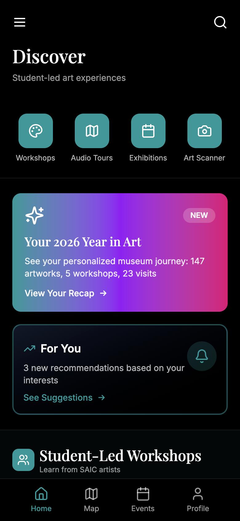
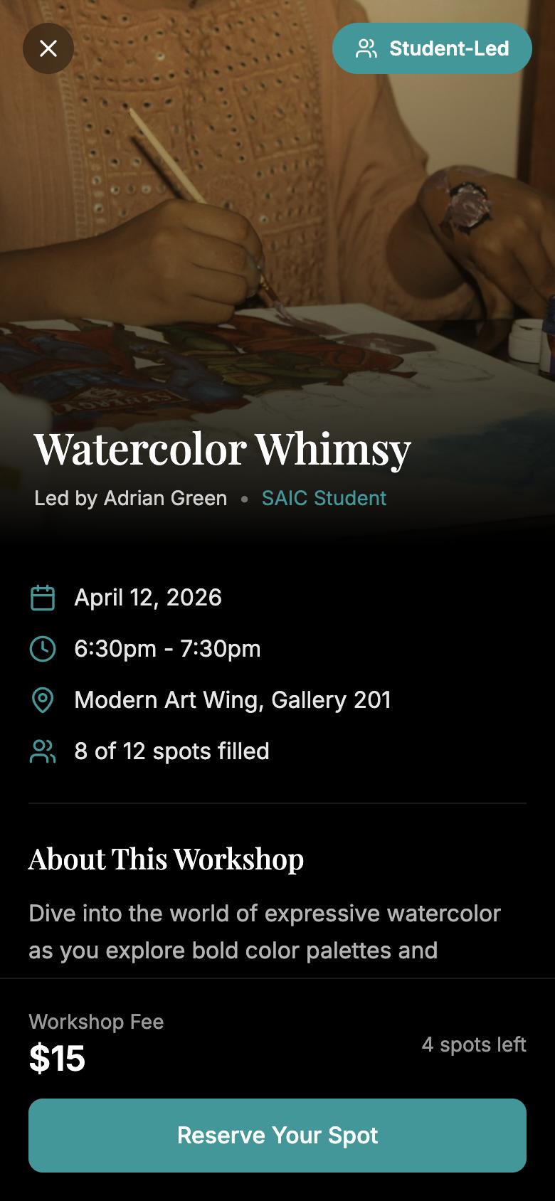
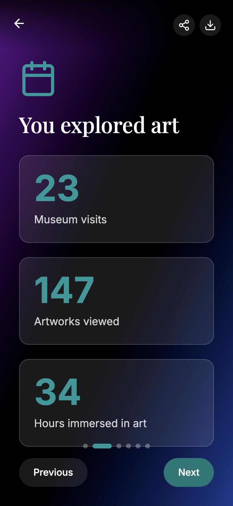
Screens from our coded prototype in Figma Make.
The problem
A museum young adults don’t think to visit
The AIC’s visitors skew older and affluent, and few people use its self-guided app. Our brief: attract 18–25 year olds and turn the app into a reason to come back.
“It’s not that I don’t want to go to the museum, it’s just not what I would rather do.”
INTERVIEW PARTICIPANT, 22
× Cost, time and parking come first
× Exhibits feel passive and reading-heavy
× The app is a map, not a reason to go
From one of the interviews I ran.
My role
I led the research and built the coded prototype
Research
Did the most research on our team, from secondary sources to the competitive scan.
Site visit
Visited the Art Institute to observe young visitors and test the current app in the galleries.
Interviews
We each ran interviews. I wrote mine with the funnel technique, then transcribed and coded three.
Prototype
Elevated our concept from static screens to a working, AI-assisted prototype in Figma Make.
What we learned
Five methods, three patterns
We combined secondary research, a competitive scan (MCA’s 21Minus, Elmhurst’s Create With Us, the Science Museum’s Lates), a heuristic review of the AIC app, a site visit and interviews.
Friends are the ticket
No one we talked to planned a solo visit. Museums happen when a friend asks.
“If you have someone there to talk about what you’re reading, it just makes things more interesting.”
Apps are tools, not reasons
People download a museum app for a map or tickets, then delete it.
“I won’t download an app unless I need it.”
Relevance beats permanence
Seeing the same collection twice is a reason to stay home.
“Maybe a current issues exhibit would be nice.”
“The app’s mental model doesn’t match the physical museum.”
Heuristic evaluation · top issue, severity 3.75 of 4
From insights to features
Every insight became one feature
We made the app useful first and social second. Two of my ideas from synthesis, the Year in Art recap and exhibit voting, became core features.
People go with friends
Student-led social workshops
Apps are kept only if useful
Map and artwork audio
They want current, relevant art
Vote on 2027 exhibitions
They trust peers over institutions
SAIC students as hosts
They want something to share
Year in Art recap
Synthesis
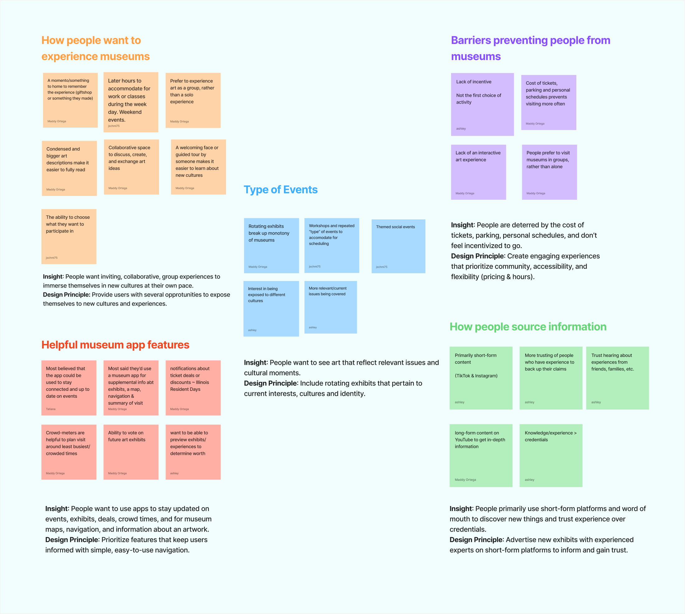
Five insights, four How Might We questions
Our affinity map in FigJam. The question we built around: how might we design an app that aids the museum visit instead of distracting from it?
Usability testing
Testers found events fast, but expected more to be tappable
We ran task-based tests on the prototype: sign up for a workshop, find an event on a given date, and find an exhibit on the map.
Found events through the top nav, then the calendar
Events work; make whole calendar cards clickable
Tried to tap exhibits and quick actions on the map
The map needs to be interactive, not a picture
Iteration
We steered away from points and badges
Why
Rewards systems came up in brainstorming, but interviewees were skeptical of gamified apps that pull attention from the art. We prioritized features people could share or shape instead: the Year in Art recap and exhibit voting.
Final design
Useful first, social second
A dark, gallery-like interface with one teal accent keeps the art in front. The map and audio sit one tap away, and social features layer on top.
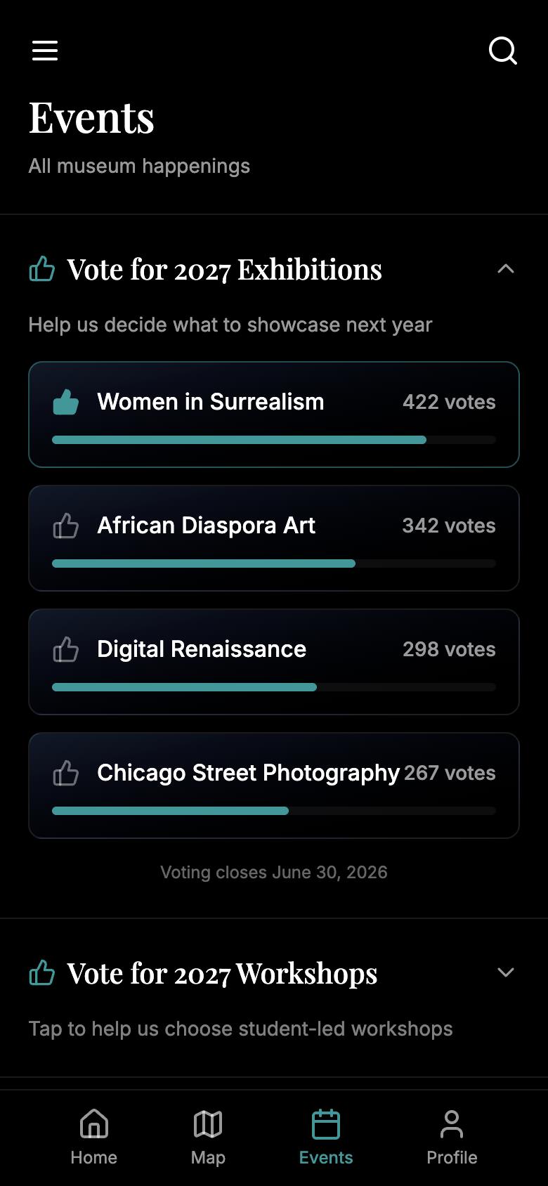
Home, a student-led workshop, exhibit voting and the Year in Art recap.
• Workshops paired with a matching tour
• Audio by artwork number
• Vote on next year’s exhibits
• Shareable Year in Art recap
This is a class concept, not an AIC product. Events, people and photos in the prototype are placeholders.
Try the prototype →
Results
5
research methods behind one program and app concept
We delivered a program concept built on student-led workshops, plus a working mobile prototype that supports it.
Worked
The event flow tested well
One tester called the home and events pages the best version yet.
Needs work
The map felt static
Testers kept tapping exhibits and quick actions that weren’t interactive yet.
Next
• Interview young adults outside universities, who don’t get in free
• Test whether the app actually increases in-museum use
Reflection
Design for why people show up
Points and badges were the easiest ideas to get excited about, but the interviews kept pointing to friends, relevance and something to share. Next time I’d test that earlier, and with young adults outside of school, since most of our participants already got in free.
NEXT PROJECT
Caterpillar Payload Monitor
Senior Capstone · Industrial interface redesign
→


Research Project · Art Institute of Chicago
AIC Social Third Space
Redesigning the Art Institute’s self-guided app around what 18–25 year olds said would get them in the door: friends, relevance and easy ways to join in.
UX Research
Thematic Coding
Heuristic Evaluation
AI Prototyping
My role
UX Researcher & Designer
Team
4 designers
Timeline
10 weeks · Winter 2026
Result
Coded mobile prototype
Screens from our coded prototype in Figma Make.
The problem
A museum young adults don’t think to visit
The AIC’s visitors skew older and affluent, and few people use its self-guided app. Our brief: attract 18–25 year olds and turn the app into a reason to come back.
“It’s not that I don’t want to go to the museum, it’s just not what I would rather do.”
INTERVIEW PARTICIPANT, 22
× Cost, time and parking come first
× Exhibits feel passive and reading-heavy
× The app is a map, not a reason to go
From one of the interviews I ran.
My role
I led the research and built the coded prototype
Research
Did the most research on our team, from secondary sources to the competitive scan.
Site visit
Visited the Art Institute to observe young visitors and test the current app in the galleries.
Interviews
We each ran interviews. I wrote mine with the funnel technique, then transcribed and coded three.
Prototype
Elevated our concept from static screens to a working, AI-assisted prototype in Figma Make.
What we learned
Five methods, three patterns
We combined secondary research, a competitive scan (MCA’s 21Minus, Elmhurst’s Create With Us, the Science Museum’s Lates), a heuristic review of the AIC app, a site visit and interviews.
Friends are the ticket
No one we talked to planned a solo visit. Museums happen when a friend asks.
“If you have someone there to talk about what you’re reading, it just makes things more interesting.”
Apps are tools, not reasons
People download a museum app for a map or tickets, then delete it.
“I won’t download an app unless I need it.”
Relevance beats permanence
Seeing the same collection twice is a reason to stay home.
“Maybe a current issues exhibit would be nice.”
“The app’s mental model doesn’t match the physical museum.”
Heuristic evaluation · top issue, severity 3.75 of 4
From insights to features
Every insight became one feature
We made the app useful first and social second. Two of my ideas from synthesis, the Year in Art recap and exhibit voting, became core features.
Insight
Feature
People go with friends
→
Student-led social workshops
Apps are kept only if useful
→
Map and artwork audio
They want current, relevant art
→
Vote on 2027 exhibitions
They trust peers over institutions
→
SAIC students as hosts
They want something to share
→
Year in Art recap
Synthesis
Five insights, four How Might We questions
Our affinity map in FigJam. The question we built around: how might we design an app that aids the museum visit instead of distracting from it?
Usability testing
Testers found events fast, but expected more to be tappable
We ran task-based tests on the prototype: sign up for a workshop, find an event on a given date, and find an exhibit on the map.
We saw
What it means
Found events through the top nav, then the calendar
Events work; make whole calendar cards clickable
Tried to tap exhibits and quick actions on the map
The map needs to be interactive, not a picture
Iteration
We steered away from points and badges
Why
Rewards systems came up in brainstorming, but interviewees were skeptical of gamified apps that pull attention from the art. We prioritized features people could share or shape instead: the Year in Art recap and exhibit voting.
Final design
Useful first, social second
A dark, gallery-like interface with one teal accent keeps the art in front. The map and audio sit one tap away, and social features layer on top.
Home, a student-led workshop, exhibit voting and the Year in Art recap.
• Workshops paired with a matching tour
• Audio by artwork number
• Vote on next year’s exhibits
• Shareable Year in Art recap
This is a class concept, not an AIC product. Events, people and photos in the prototype are placeholders.
Try the prototype →
Results
5
research methods behind one program and app concept
We delivered a program concept built on student-led workshops, plus a working mobile prototype that supports it.
Worked
The event flow tested well
One tester called the home and events pages the best version yet.
Needs work
The map felt static
Testers kept tapping exhibits and quick actions that weren’t interactive yet.
Next
• Interview young adults outside universities, who don’t get in free
• Test whether the app actually increases in-museum use
Reflection
Design for why people show up
Points and badges were the easiest ideas to get excited about, but the interviews kept pointing to friends, relevance and something to share. Next time I’d test that earlier, and with young adults outside of school, since most of our participants already got in free.

NEXT PROJECT
Caterpillar Payload Monitor
Senior Capstone · Industrial interface redesign
→