Senior Capstone · Caterpillar Inc.
Caterpillar Payload Monitor
Redesigning a wheel loader's payload display so operators can make loading decisions at a glance, in half the screen space.
UX Research
Information Design
Cognitive Load
Glanceability
My role
UX Research Lead
Team
3 designers
Timeline
Jan–Jun 2026
Result
~50% smaller display
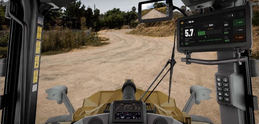
The final payload display, mounted on the right-side cab panel.
The problem
Operators were doing math mid-swing
The payload screen showed four numbers with equal weight and no warning before overload.
Caterpillar asked us to cut its footprint by at least 50% without losing safety.
The brief, in Caterpillar’s words: “Basic payload lacks consistency across products and requires significant display real estate.”
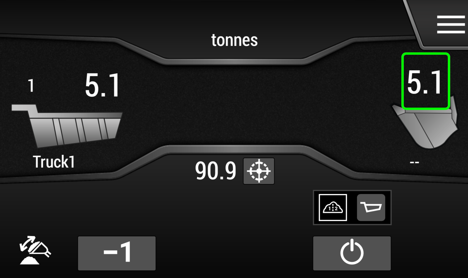
The original screen: four numbers, no sense of how close the truck is to its limit.
My role
I led the research and kept us tied to the requirements
Site visit
Visited Caterpillar, interviewed expert operators and used the equipment simulators myself.
Research
Wrote the interview guide and led the cognitive walkthrough, heuristic evaluation and competitive review.
Client reviews
Led weekly prototype reviews with Caterpillar's UX lead: set the agenda and presented the research behind each design.
Critique
Held every concept to Caterpillar's requirements, which shaped which ideas we kept.
What we learned
Operators watch the truck, not the screen
They glance; they don't read
The display sits off to the side and gets 1–2 second looks.
Stress peaks at one decision
Add another bucket, or dump?
That's the moment the screen has to help.
They think in fullness
Operators ask "how close am I?",
not "what's the exact weight?"
"Operators are not tech boys. Keep us super simple."
Caterpillar operator, site visit
From findings to rules
Four problems became four design rules
Our evaluation found 3 critical, 5 major and 4 minor issues. Each pattern became a rule every concept had to pass.
No early warning
Critical
Warn before the limit
Numbers everywhere
Show the consequence
Everything weighted the same
Most urgent state wins
Layout never changes
Calm until it matters
Client feedback
Caterpillar’s feedback set our priorities
Weekly prototype reviews with Tom Beccue (UI/UX Manager & UX Team Lead) and Jayce Van De Veer (UI/Graphic Designer) made glanceability and low cognitive stress our top priorities.
Warn before the next pass goes over
Added a prediction stack and Tip-Off state
Red reads as “power off” to operators
Gauge fills grey to green; warnings use amber and orange
Stay simple until attention is needed
Collapsed by default; expands near the target
A full radial gauge could overwhelm the screen
Cut the radial gauge for a compact horizontal bar
Iteration
We cut the concept that looked the most dramatic
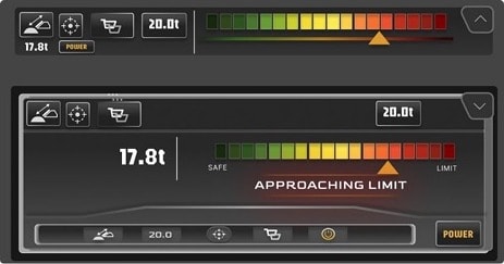
Kept · layout
Condensed Horizontal
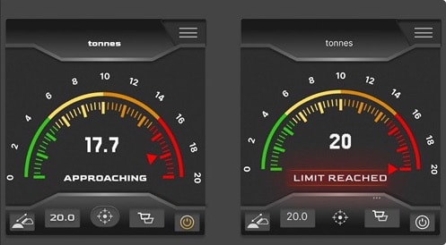
Cut
Radial Gauge
Kept · warning states
Horizontal Threshold
My critique
The radial gauge conveyed urgency, but it took too much screen space for the 50% requirement, was difficult to flag, and could be confused with the machine's other gauges. I pushed us back to the requirements, toward a compact horizontal layout.
Final design
Quiet while loading, clear before overload
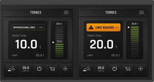
Seven states take a truck from unassigned to complete. The display only gets louder as the load nears its limit, and extra controls stay hidden until needed.
Approaching

Approaching: target and over/under values grow more prominent.
Oversized current load
Safe / Approaching / Limit gauge
Predicted total before dumping
50 × 50 px glove-friendly buttons
Try the interactive prototype →
At the final review
“Spot on as far as the visual hierarchy.”
Tom Beccue, UI/UX Manager & UX Team Lead
“I love this collapsible menu structure… something we’ve been trying to figure out.”
Jayce Van De Veer, UI/Graphic Designer
In Caterpillar’s own test of four competitor systems, operators preferred a single dominant number, like our design.
Results
~50%
smaller display, meeting Caterpillar’s goal
Tested in person with an equipment operations professional and a construction operations specialist from outside Caterpillar.
Worked
Easier for newcomers
Quick to learn, which could shorten training.
Needs work
Harder for veterans
Habits from the old buttons made some changes confusing.
Next
• Co-design the controls with veteran operators
• Answer Tom’s challenge: confirm a good weigh without looking at the screen
Reflection
"Simpler" depends on who's using it
I expected a visual cleanup, but the real issue was timing: operators need different information at different moments.
Testing showed that what helps a newcomer can slow down a veteran, so next time I'd bring experienced operators in from the start.
NEXT PROJECT
Englewood Community Action Council
Client Project · Community resource website
→


Senior Capstone · Caterpillar Inc.
Caterpillar Payload Monitor
Redesigning a wheel loader's payload display so operators can make loading decisions at a glance, in half the screen space.
UX Research
Information Design
Cognitive Load
Glanceability
My role
UX Research Lead
Team
3 designers
Timeline
Jan–Jun 2026
Result
~50% smaller display
The final payload display, mounted on the right-side cab panel.
The problem
Operators were doing math mid-swing
The payload screen showed four numbers with equal weight and no warning before overload.
Caterpillar asked us to cut its footprint by at least 50% without losing safety.
The brief, in Caterpillar’s words: “Basic payload lacks consistency across products and requires significant display real estate.”
The original screen: four numbers, no sense of how close the truck is to its limit.
My role
I led the research and kept us tied to the requirements
Site visit
Visited Caterpillar, interviewed expert operators and used the equipment simulators myself.
Research
Wrote the interview guide and led the cognitive walkthrough, heuristic evaluation and competitive review.
Client reviews
Led weekly prototype reviews with Caterpillar's UX lead: set the agenda and presented the research behind each design.
Critique
Held every concept to Caterpillar's requirements, which shaped which ideas we kept.
What we learned
Operators watch the truck, not the screen
They glance; they don't read
The display sits off to the side and gets 1–2 second looks.
Stress peaks at one decision
Add another bucket, or dump?
That's the moment the screen has to help.
They think in fullness
Operators ask "how close am I?",
not "what's the exact weight?"
"Operators are not tech boys. Keep us super simple."
Caterpillar operator, site visit
From findings to rules
Four problems became four design rules
Our evaluation found 3 critical, 5 major and 4 minor issues. Each pattern became a rule every concept had to pass.
Problem
Rule
No early warning
Critical
→
Warn before the limit
Numbers everywhere
→
Show the consequence
Everything weighted the same
→
Most urgent state wins
Layout never changes
→
Calm until it matters
Client feedback
Caterpillar’s feedback set our priorities
Weekly prototype reviews with Tom Beccue (UI/UX Manager & UX Team Lead) and Jayce Van De Veer (UI/Graphic Designer) made glanceability and low cognitive stress our top priorities.
They told us
We responded
Warn before the next pass goes over
Added a prediction stack and Tip-Off state
Red reads as “power off” to operators
Gauge fills grey to green; warnings use amber and orange
Stay simple until attention is needed
Collapsed by default; expands near the target
A full radial gauge could overwhelm the screen
Cut the radial gauge for a compact horizontal bar
We cut the concept that looked the most dramatic
Iteration
Kept · layout
Condensed Horizontal
Cut
Radial Gauge
Kept · warning states
Horizontal Threshold
My critique
The radial gauge conveyed urgency, but it took too much screen space for the 50% requirement, was difficult to flag, and could be confused with the machine's other gauges. I pushed us back to the requirements, toward a compact horizontal layout.
At the final review
“Spot on as far as the visual hierarchy.”
Tom Beccue, UI/UX Manager & UX Team Lead
“I love this collapsible menu structure… something we’ve been trying to figure out.”
Jayce Van De Veer, UI/Graphic Designer
In Caterpillar’s own test of four competitor systems, operators preferred a single dominant number, like our design.
Results
~50%
smaller display, meeting Caterpillar’s goal
Tested in person with an equipment operations professional and a construction operations specialist from outside Caterpillar.
Worked
Easier for newcomers
Quick to learn, which could shorten training.
Needs work
Harder for veterans
Habits from the old buttons made some changes confusing.
Next
• Co-design the controls with veteran operators
• Answer Tom’s challenge: confirm a good weigh without looking at the screen
Reflection
"Simpler" depends on who's using it
I expected a visual cleanup, but the real issue was timing: operators need different information at different moments.
Testing showed that what helps a newcomer can slow down a veteran, so next time I'd bring experienced operators in from the start.
NEXT PROJECT
Englewood Community Action Council
Client Project · Community resource website
→
Final design
Quiet while loading, clear before overload
Seven states take a truck from unassigned to complete. The display only gets louder as the load nears its limit, and extra controls stay hidden until needed.
Approaching
Approaching: target and over/under values grow more prominent.

Oversized current load
Safe / Approaching / Limit gauge
Predicted total before dumping
50 × 50 px glove-friendly buttons
Try the interactive prototype →